Tuesday, March 31, 2009

Keeping it Simple


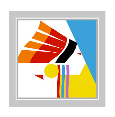
The assignment was to generate a design which would represent different peoples of the world. They would be displayed in a gallery during a missions emphasis month for a local church. So how to utilize one human form to represent a country? I decided on traditional attire and landmarks for each country and limit these designs using only basic shapes. The limited shapes were circle, square and triangle, in any dimension. Utililizing positive and negative space was the fun part and key to keeping this simple yet recognizable. More countries were added and curves were incorporated within the design. The above designs represent Native America, India and Latin America. Look for more tomorrow and I will explain how they were done.

Monday, March 30, 2009

Tonto National Forest


This is a quick study of cacti in the area, in particular, the giant saguaro. Note the repetition of color stroke waves from the mountains to the sky. Northeast of Phoenix is the nearly 3 million acres of Tonto National Forest. I was only able to touch the southern end of this huge, diverse area, Roosevelt Lake being my destination thru the Superstition Mountains. This land is still very rugged with limited access. Harsh winters are common. Amazing, that about 50 miles southwest is Phoenix, where harsh winters is not a phrase in their vocabulary.

Return to Mesa


An amazing thing about the desert is just add water and practically anything will grow in southern Arizona. This capture of a typical residential corner is full of life, though the brown ground seemingly suggests the earth is dead. The sketch needed more color so I suggested a red sky sky with bold strokes of Prismacolor. It balances the entire sketch, as the strokes contrast to the cacti on the ground, but also echo a relationship to the overall composition of the plant life on the earth.

Sunday, March 29, 2009

Kingman, Arizona


After passing over some remaining sections of famous Route 66 near Kingman, I spotted this barn of character. My customery marker and pencil media used again.

Saturday, March 28, 2009

Magma P.I.


While I am on the Arizona subject, here is another sketch from the same period. The massive rock formations on Magma Mine Road really dominated this area with golden hues and browns. Colored pencil is the media.

Do you struggle to find something "interesting" to draw in your area of existance? But, when traveling to new sites, how amazingly easy it is to draw almost "anything?" It can depend on where you live, but there is always something to draw. Spooling up the inspiration to do it is another matter. We have all been there. For those starting out drawing for fun or profit, do not "push" the subject. There may, in fact, be days when you just cannot bring yourself to get out and sketch. Remember January? It is probably a time to take a break. Step away until another day.

Thursday, March 26, 2009

Arizona Cactaceae Maximia


Perhaps the best time to visit southern Arizona is April. Although, spring is a welcome change about anywhere. During one of my last trips to Arizona, I took the opportunity to sketch some of the "sights." The cacti started their explosion of color and the temps were perfect. The above is a study of the Purple Prickly Pear, Stag Horn cacti and more done in marker and Prismacolor pencils. Again, using that wonderful Artagain paper.

Wednesday, March 25, 2009

Music Book Cover


Today features a cover for a solo pianist music book. The design of the piano graphic was done without a computer and presents a lively display. The typography settles in nicely and contrasts with the white space on the left side, above and below the graphic. The chosen font adds a sophistication to the cover. Note the repetition of the short, vertical lines and 2nd and 3rd colors. If you have a significant element, try to repeat it somewhere in the design. Just do not overdo it. See next paragraph.


There's a simplicity to the overall cover, despite the graphic activity. Keeping a design simple is always the way to approach any design. Getting overwhelmed with details too soon can kill a design.

Tuesday, March 24, 2009

Logo Design


This is an icon design for an active, older adult ministry group. The leaves and vines, coupled with the vibrant green, add a sense of energy and growth. This design was hand drawn with markers, then taken into Photoshop to finish.
Working with a client takes a lot of listening. You want to capture their intent and purpose for the design, an icon in this instance. Never force your ideas. There may be an aspect of your design they are not totally happy with. Ask yourself if that aspect you are clinging to is really that important. Chances are, it is not, and you both can be pleased with the end result.

Monday, March 23, 2009

Mesa Detail


Here's a closeup of the sketch. Artagain paper comes in full size sheets or you can purchase a 9x12 pad that includes a variety of paper stock colors.

Mesa, Arizona

Located this old sketch and decided to scan and share it. It is a lovely apartment complex where my father lived for a few years. The courtyard was a nice little oasis and the palms added an exotic touch. This was done in marker and pencil on Artagain paper.

Sunday, March 22, 2009

Ron's Kwik Mart


East of Frankfort is the little burg of Michigantown. It provided an interesting mix of past and present. Typical of many small towns across America, original store fronts try to accomodate convience stores. This is a rather tacky example of bad word sequencing on the signage. Perhaps not as well thought out as it might have been! This sketch was done in magic marker and colored pencil.

Friday, March 20, 2009

Life's Road


I will get back to the Frankfort area soon, but here's a design & illustration done in Prismacolor pencils on Artagain paper. The intended use for the art was for a memorial pamphlet for someone who has lost a loved one. The highway (journey) visualizes life's road with it's ups and downs. The distance of life. The sunset revealing the waning years of life. Personally, I hear some Pat Metheny music in the background, turning this solumn theme into an anticipating journey. But maybe that's just me.

Thursday, March 19, 2009

Frankfort Courthouse


While in Frankfort, Indiana, I made a rather rushed sketch of the courthouse. Quite a magnificent structure, though I am afraid my sketch does not do it justice. The downtown is located on higher ground and if you approach from the east, as I did last summer by bicycle, or the north, it's "uphill" to get there. So maybe it's uptown? But I digress. The courthouse rises high in the sky and dominates downtown. Still a pretty active small town of 16,600+ with many turn of the century buildings in fine shape. That bike trip was 100 miles round trip, btw.

Frankfort, Indiana


This old coal tower was still standing as of 2008. It's in surprisingly good shape considering it was built (perhaps) 70 years ago. Don't know the exact build date. The wooden sign on the tower is still quite readable, though the other side has faded out by the sun. The tower sets in the Northfolk Southern Railroad yards, west of town. Long story short, the New York, Chicago & St. Louis Railroad "Nickel Plate Road" was merged with Norfolk Western RR in 1964, which was eventually swallowed up by Norfolk Southern. The tower remains a fine testament to the steam engine days of yore. The sketch was made from a residential street that dead ends at the yard. When I return in the future, I hope the structure is still in one piece.